
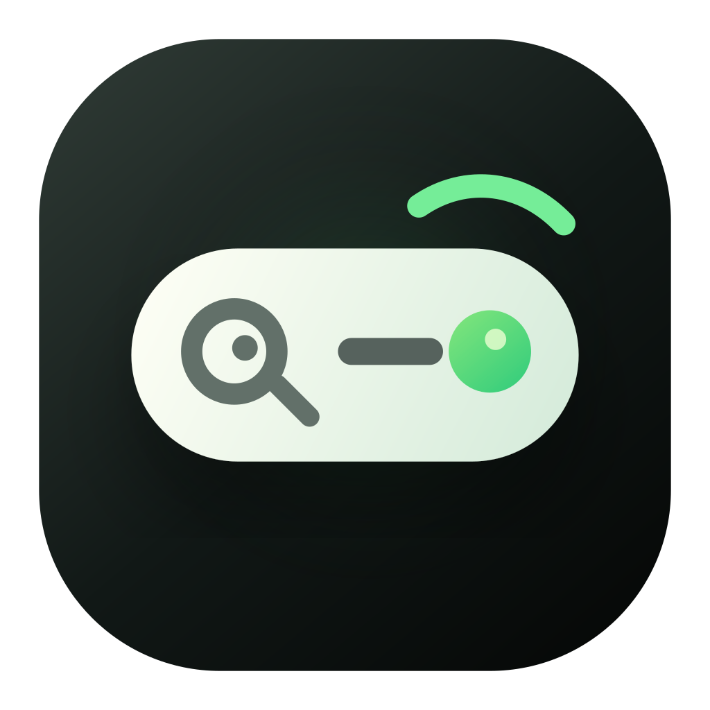
Desktop app icon
Readable in the Dock, with a dark green tile and light command capsule.
Brand
Final mark
The dark rounded tile carries desktop app stability. The light capsule means command input and search. The green status dot means ready. The upper-right signal arc makes the mark feel responsive rather than static.
It should first read as a place to search, input, and run.
The gaze moves right without becoming an exaggerated face.
The mark is tuned for Dock, menu bar, website, and developer docs.
Assets
The official set covers desktop app icon, web logo, favicon, small sizes, light and dark use, flat, mono, full lockup, apparel, and merchandise previews.
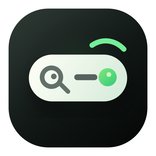
Readable in the Dock, with a dark green tile and light command capsule.
Pairs with the Jingle wordmark in navigation and docs while staying product-like.

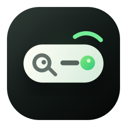
Small sizes keep the capsule, search read, and green dot while reducing detail.
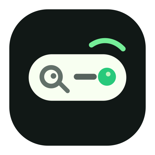
The main icon does not split into two identities; its own tile works on both backgrounds.

For diagrams, compact UI, and surfaces that need lower rendering complexity.

For print, embossing, partner placements, and minimal UI contexts.

For launch graphics, brand pages, partner pages, and full brand presence.
Works best as a small badge rather than an oversized decorative graphic.
Fits stickers, mugs, tote bags, and lightweight team material.
Design tokens
The website background, panels, accents, focus ring, icon shadow, and brand previews use the same color and radius system so pages do not drift apart.
#111816
#f7f4ec
#fffdf7
#fffff6
#28c97b
#e5bf62
#66706b
#dfe7dc
icon 25.5px / card 8px
0 24px 38px rgba(17, 24, 22, 0.22)
/brand/jingle-mark.svg
/brand/favicon.svg
/brand/jingle-lockup-light.svg
Downloads
Use SVG for design and web surfaces. Use PNG for app icons, favicons, small previews, documentation screenshots, and external material.